Welcome.
Good to have you here.

I worked as a Product Designer across two Card squads, focusing on credit card statement visibility, status, and payment — one of the company’s core products.
The credit card is the primary product at willbank and central to its value proposition. Clear visibility of statement status, dates, and amounts is critical to building trust and preventing delinquency.
We identified that key information was either unclear or poorly timed, leading to confusion and high support volume.
This is a short version of the case. Let's chat and I'll share the full details*
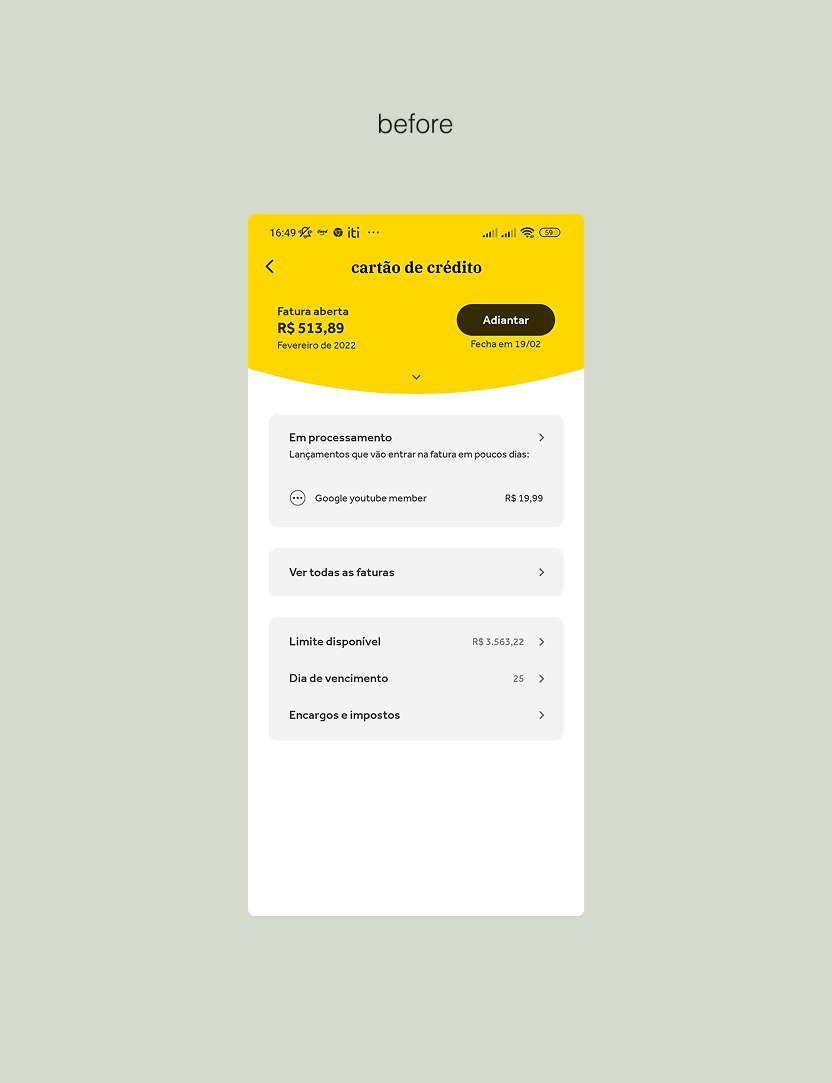
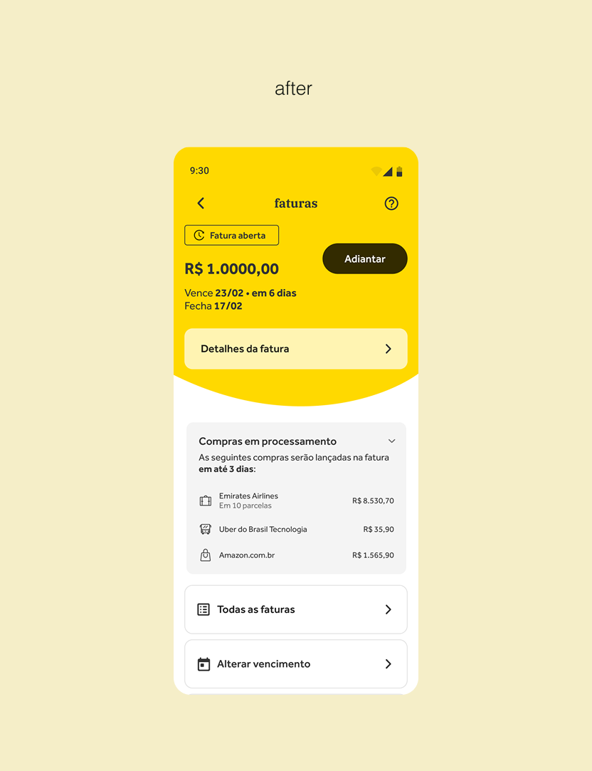
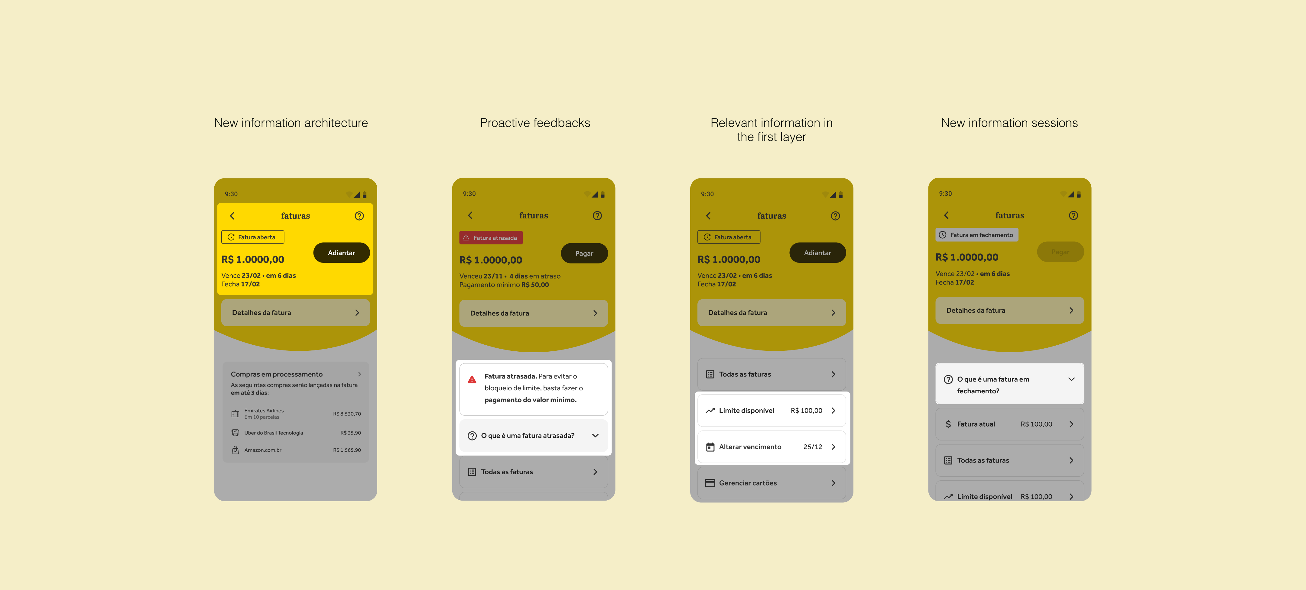
The statement experience failed to clearly communicate the real-time status of the credit card.
Key challenges:
Difficulty understanding total statement amounts (open, closed, future)
Poor visibility of closing date, due date, and best purchase day
Unclear statement status transitions
Confusion between delinquency and remaining balance after partial payment
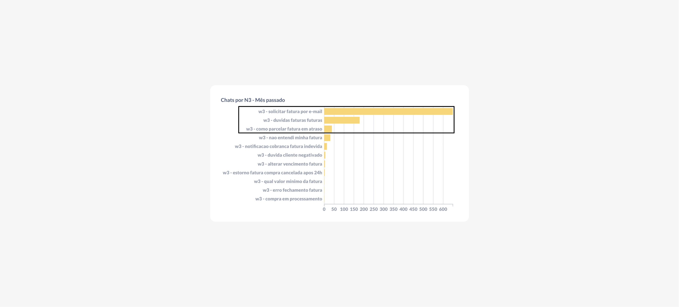
High volume of support tickets related to billing
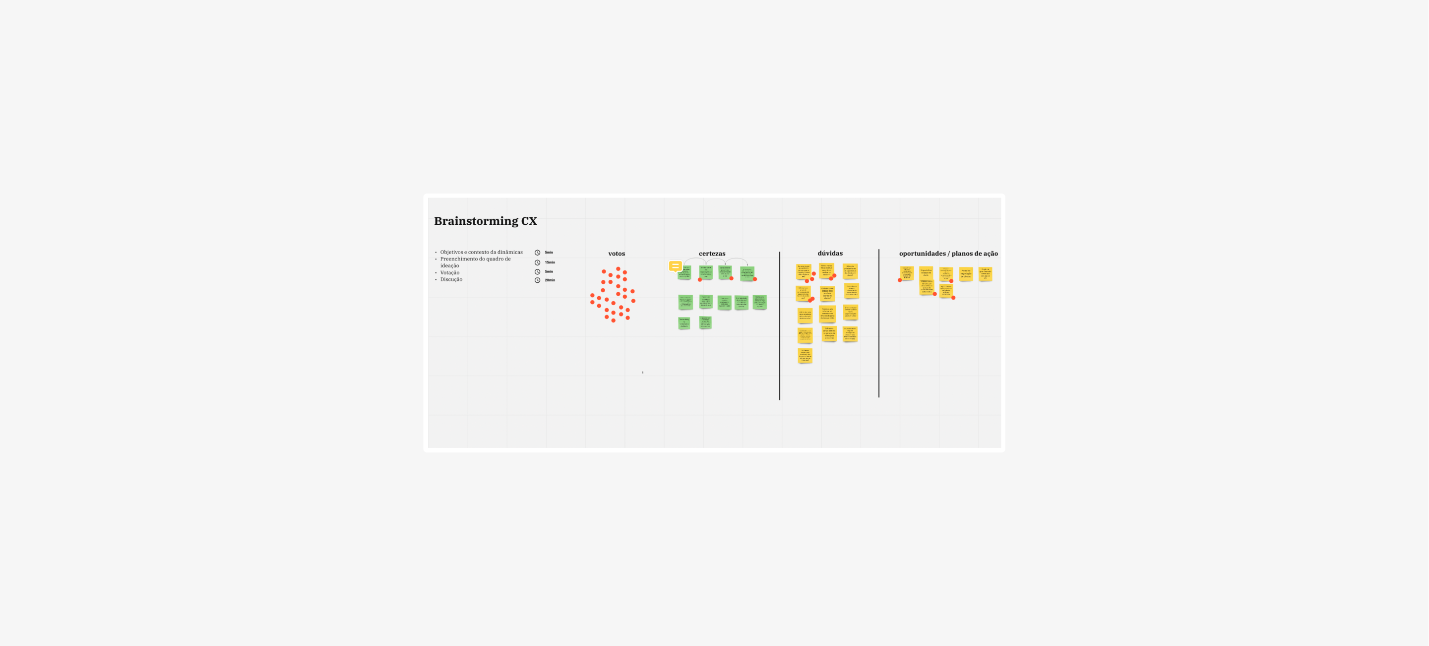
I led a discovery phase in collaboration with designers, researchers, CX, and stakeholders.
Key activities:
Desk research and competitive benchmarking
Workshops with CX analysts to deepen problem understanding
In-depth user interviews with active cardholders
Prototyping and quantitative testing via Maze
Design critiques and refinement of the credit home architecture
Users struggled to predict how much they would pay
Pending transactions caused uncertainty
Important dates lacked visibility and context
Statement status changes were not clearly communicated
Partial payments still triggered confusing delinquency messages
We created a roadmap based on some insights we had in the previous phase and synthesized all the learnings in an experience that we validated via a prototype created in Maze that was sent to a base of 5 thousand customers according to the profile of active users with the credit card from willbank.
Usability testing:
63% completed the task following the expected paths
84% found the task easy
81% were able to respond to tasks as expected on the due date.
74% managed to understand and found easy access to anticipate and pay the invoice in installments.
77% found visibility into invoice status information easier in this new version.
Some comments:
"That way it would be much more practical to view the informations!"
"Very good, the new screen is amazing, you just need to increase the limit more consistently"
"I liked the terms they put, it was easier to understand the day my invoice will expire"
"I loved the new area. A suggestion of mine is to be able to add the card to a digital wallet, like Google Pay"
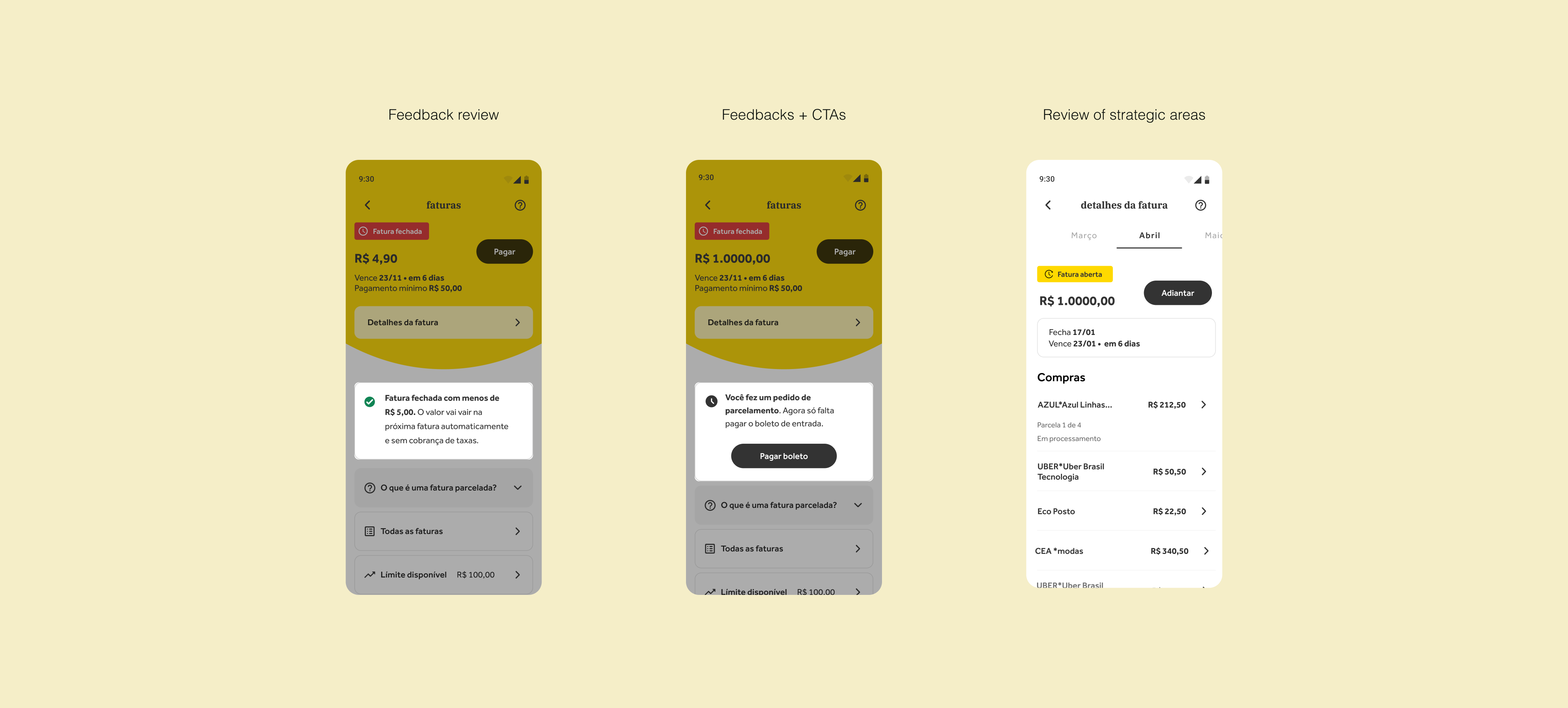
The project delivered a new credit home architecture covering all statement scenarios, with full handoff documentation, accessibility guidelines, and tracking events.
Although I did not follow the final rollout after leaving the company, the work was directly tied to key metrics such as:
Key metrics:
Reduced support volume
Increased on-time payments
Lower delinquency rates