Welcome.
Good to have you here.

I worked as the Product Designer for the Cash In squad at PicPay, one of Brazil’s largest financial apps. The focus was on simplifying critical money-in flows, increasing user confidence, and reducing operational overhead.
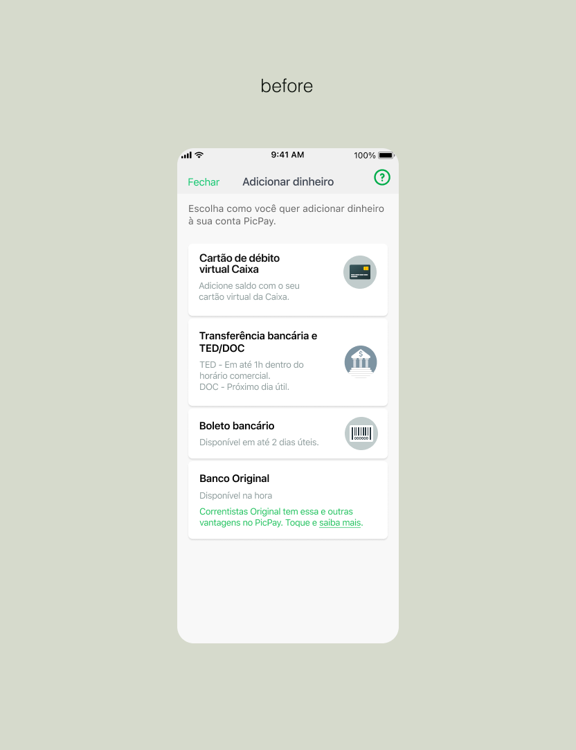
Boleto was a key Cash In method but suffered from high cancellation rates, generic feedback, platform inconsistencies, and a strong impact on customer support. The feature had been launched without a structured design process.
This is a short version of the case. Let's chat and I'll share the full details*
The Cash In via boleto experience suffered from usability, communication, and performance issues that directly impacted both users and the business.
Key challenges:
High cancellation rate shortly after boleto generation
Generic and reactive error messages
Inconsistent UI and content between iOS and Android
Lack of clarity around deadlines, availability, and weekends
Dependency on unstable third-party providers
Significant impact on customer support volume
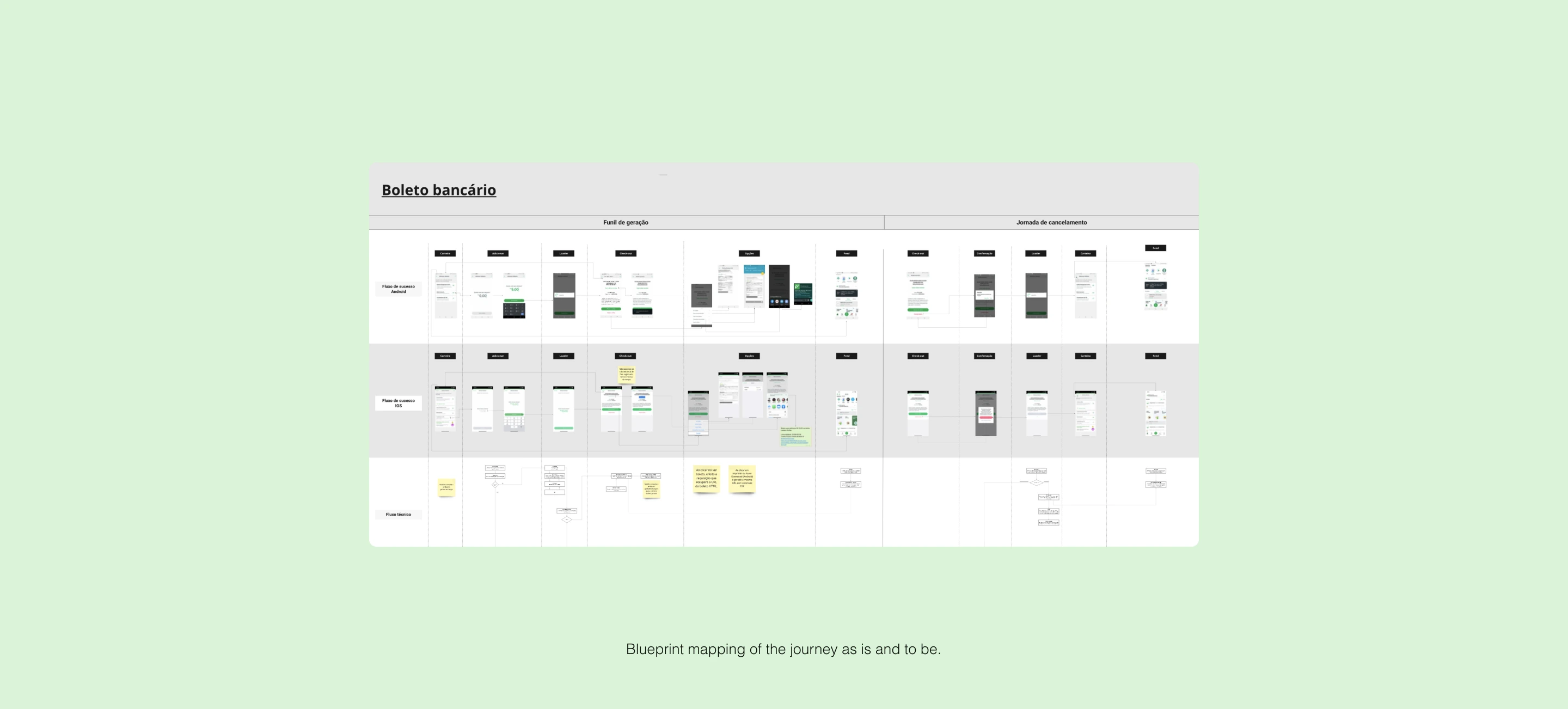
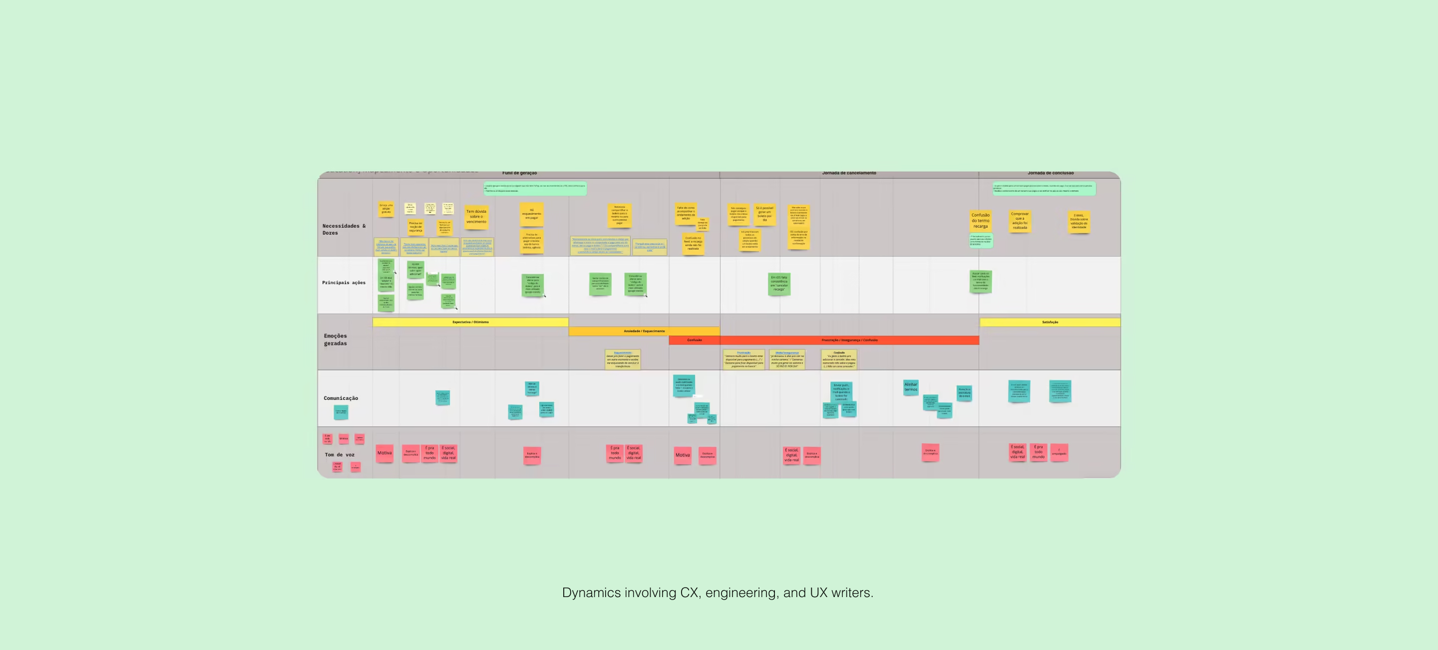
I led a discovery phase combining data analysis, stakeholder interviews, quantitative user research, and usability testing. I worked in close collaboration with engineering and CX teams to map pain points, validate hypotheses, and define clear success metrics.
Key activities:
Qualitative and quantitative analysis of support tickets
Stakeholder interviews with teams involved in the initial release
Journey mapping using service blueprints
Behavioral data analysis using analytics tools
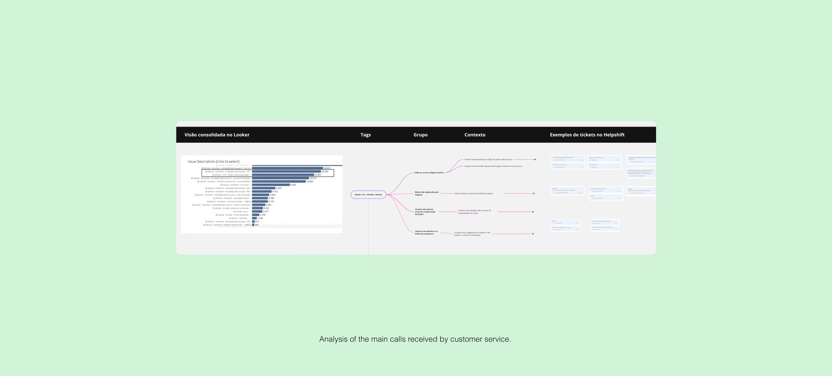
Key insights:
Over 60% of boletos were canceled within 5 minutes
Users often generated a boleto but did not realize when it was available for payment
No proactive communication about delays, outages, or weekends
Frequent payments after the expiration date
No centralized place to manage generated boletos
Incomplete tracking events, limiting funnel analysis
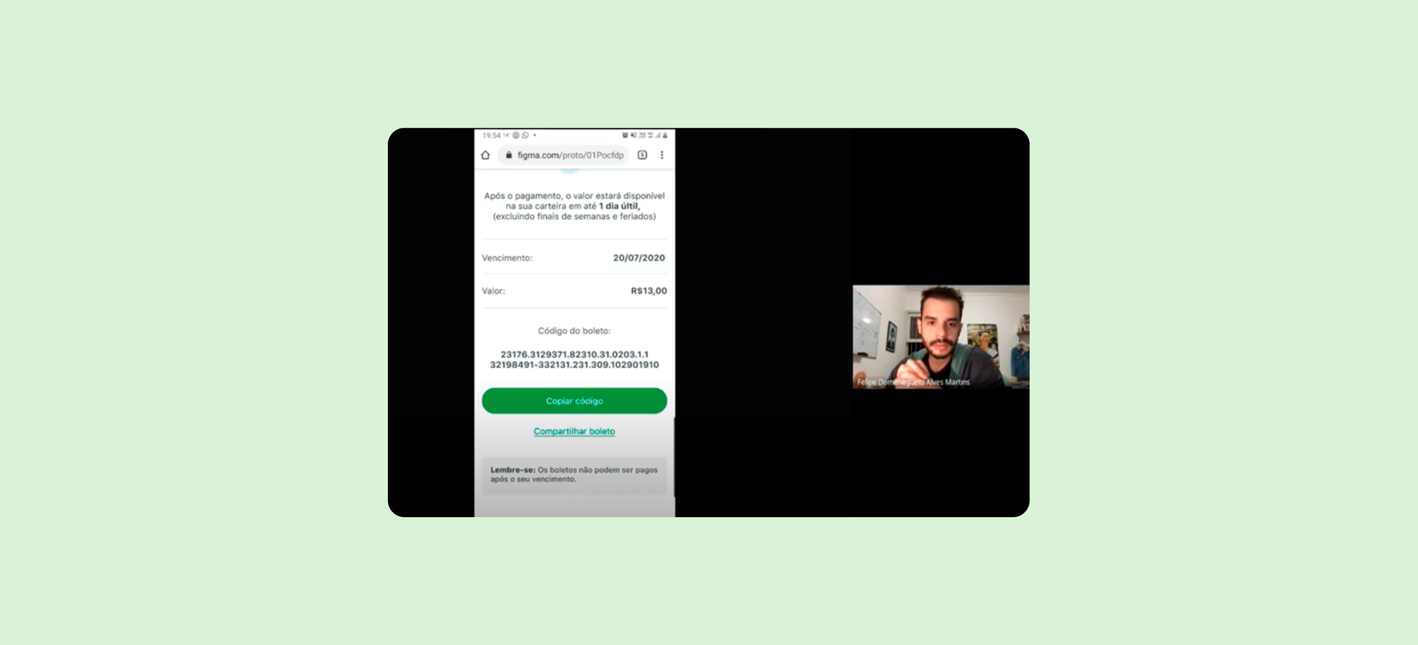
7 moderated remote usability tests
Users who had used the feature at least once in the last 30 days
Solutions:
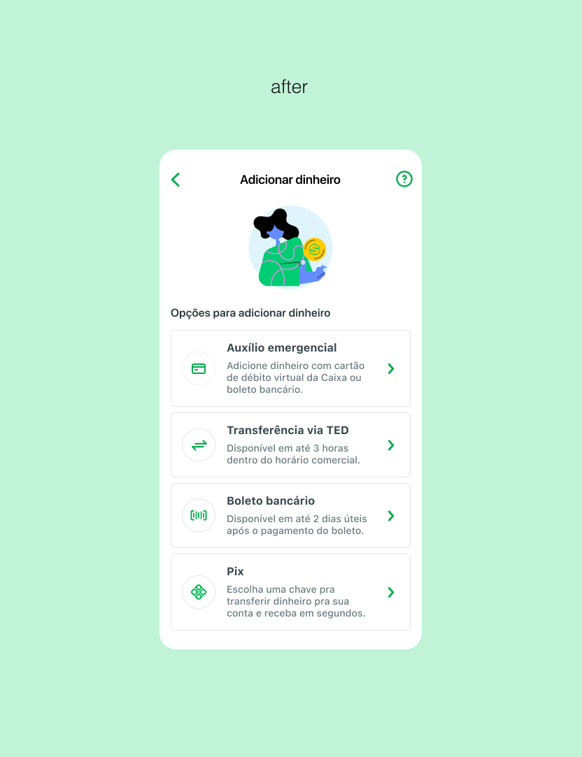
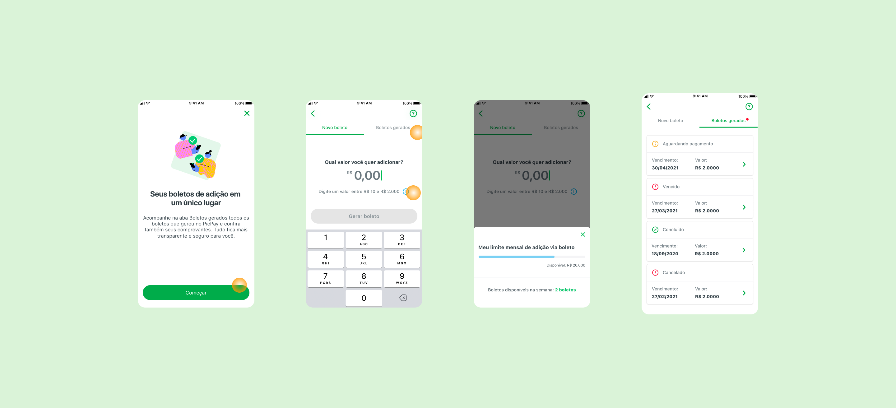
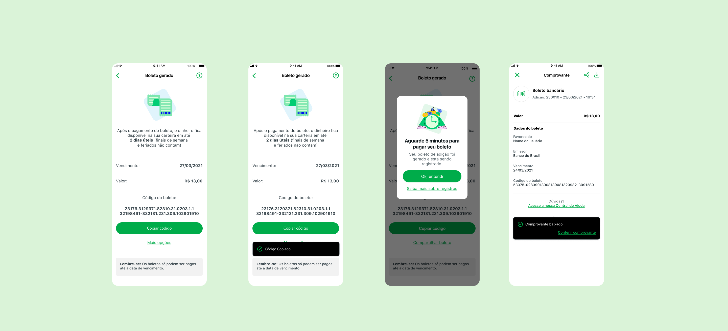
I redesigned the experience with a strong focus on clarity, predictability, and control.
Boleto management area: centralized view of all generated boletos with clear status and quick actions
Improved content and feedback: clearer messages about deadlines, availability, and rules
Proactive communication: push and email notifications providing real-time context during the journey
Usability testing:
The flow was perceived as simple and intuitive
Better understanding of weekend and availability rules
The management area supported users’ financial organization
Clearer feedback increased trust in the process
Significant reduction in support tickets related to boleto
Average boleto registration time dropped from 30 to 5 minutes
Increase in boleto payment conversion
25% reduction in feature maintenance costs in the first semester after launch